
In every Corporate Ovations workshop I deliver, I ask my students, “How many of you want me to show 125 slides full of text, then turn my back and read to you?” It’s no surprise, the response is always zero. Then I ask a follow-up question…
“How many of you still see people doing that?” 100% of the students raise their hands with a, “Yes!” This seems shocking when you think about it. Nobody wants the speaker to read the slides and yet 100% of them still see people doing just that! If nobody wants to see that and everybody knows it, then why do people do it?!!?? Where is the disconnect?
Here are 5 shortcuts you can incorporate into your slides to keep your audiences engaged and avoid the slide-reading trap.
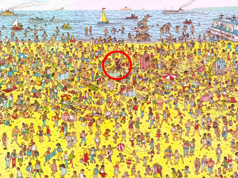
1. Don’t hide Waldo
You know the game called “Where’s Waldo?” While it’s fun trying to find Waldo with your kids, we don’t like playing that game when we’re in the audience of a business presentation. If the main point you want to make on the slide is Waldo, then make it easy to find him.
2. Title = Claim
Think of the Title on your slide as a clue to where Waldo is hiding. It should serve as a “claim” you are making. Then the contents of the slide (text, graphics, charts, etc.) should support the claim. “Acme, Inc. 4th Quarter” is not descriptive. “Acme, Inc. had highest profits in Q4” is much more descriptive.
3. Mix it up

When everything looks the same, it’s harder for the audience to find what’s important. Use different colors, fonts, sizes, shapes, placement on the slides to show the important pieces. This is definitely a balance because too much variety makes it harder to know what’s important too. This is called the Von Restorff Effect.
4. Less is More
This seems to be common knowledge, but we don’t always follow this advice. When the slides are covered with text, the speaker is tempted to read the slides like a teleprompter and the audience tends to read the slides along with them. If you use text, limit it by typing in sentence fragments and keywords only. Presentation Zen by Garr Reynolds is a great resource.
5. Use Appropriate Pictures
Professional picture or icons create short cuts to understanding. If you think about it, text is really a collection of symbols (pictures) that create words and sentences. The words and sentences must be translated into meaning. However, pictures skip a step in the translation process and jump immediately to meaning. When used effectively, pictures are easier on the audience because it’s less work for their brains. Websites like The Noun Project have free collections of professional symbols.
Make sure your slides do not create more work for your audience. If it’s hard work for them to follow you, they’ll get tired and then they’ll quit. Then the smart phones start to come out!
What do you do to make your slides more engaging?
I’m always looking for the better,
Russ

P.S. If you didn’t receive this blog post in your email inbox, you can sign up here and I’ll send it to you every Sunday.
“Very informative article.Really looking forward to read more. Cool.”
Thanks for the feedback! More to come. Best, Russ